
As designers we are asked to all design sorts of things, sometimes we love the brief we are given, and sometimes we just want to cringe…for me, this was poster design. It didn’t matter how I tried to look at it I just couldn’t get my head around poster design. I mean why do we need to design on such large pieces of paper for a small amount of information anyway? I just didn’t understand what the relevance was.
However, once I started finding posters that actually inspired me—rather than making me cringe, I started to see how poster creation could actually be an art in itself. Here are a few posters I love and a little bit about how they changed my opinion from hatred to love.
My City—by Michelle Carlslund
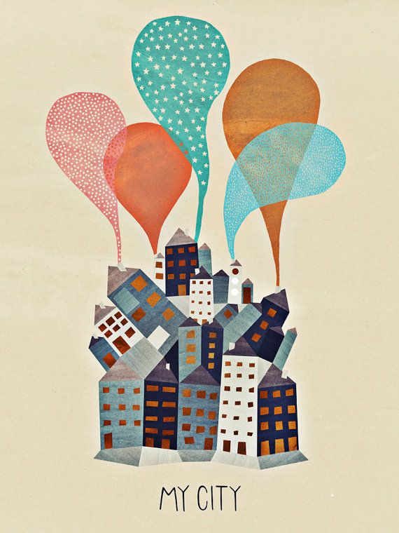
This poster incorporates texture and pattern in order to create interest in the design. What I found interesting about it is how texture can be used in line with elements of distortion to create an image with depth. I also loved the colour palette used—which mixes soft and rich tones creating a contemporary feel to the design of the poster.
Save Trees Save Earth—by Flyerfolio

This design was one that I fell in love with instantly. The poster promotes the environment using simple imagery and a fresh colour palette, as well as geometric shapes, which draw in the eye.
Built to Spill—by Justin LaFontaine

This Poster was designed to promote the band ‘Built to Spill’ in one of their 2010 shows. The poster is extremely effective in promoting the band’s name through the illustration of an oil spill in the ocean, which has links to the name ‘built to spill’, and draws attention to the poster. I also loved this design because of the use of white space, which helps to emphasize the importance of what is said and doesn’t overwhelm the viewer, as well as the contemporary colour palette, which is calm and on-trend.
500 Days of Summer—Screen Play

This Poster uses Minimalism to illustrate distinguishing features of a girl and a boy in order to emphasize the concept ‘girl meets boy’. What I loved about this was the basic eye catching colour palette and illustration which is simple yet extremely effective.
Les Americains—by Robert Efurd

This design is calming and beautiful to look at, and has been extremely effective in promoting the band ‘Les Americains’; giving people a taste of what their music is like. The typography used is easily legible and allows the subject matter to take the focus and draw attention. What I really loved about this design is it’s ability to be bold yet calming all at the same time.


