Sunday, 1 September 2013

My Favourite Album Covers


I’ve tried all methods of procrastination to avoid writing this blog post.
Cleaning, exercising, organising, and socializing in all areas of my life not relating to the work I’m meant to actually be doing. I even try telling myself that I can’t actually get stuck into my work until I have built up a playlist to last me the extensive hours I will be spending completing the work.
That’s when I had an idea.
Whilst I’m building up this 7 hour long playlist, why not choose my favourite album covers and share them with those who appreciate good design most?
So, without further ado, here are my top 10 album covers as found in my iTunes library (in no particular order). 

(That's a lie, they're in alphabetical order).

2004-2009 – The Getaway Plan

This album art  is closely linked to it's predecessor 'Other Voices, Other Rooms', which also features an iceberg, but this cover looks better (which is why it made the list...). This album was released after the band decided to call it quits in 2009, hence the release of this 'best of' album, and the art will always remind me of my young 19 year old self.

Glorious Ruins – Hillsong

Don't tell the other albums in this list, but this is my favourite album cover of all time. Daytime fireworks (which look just as amazing in real life as they do in the album art) and gold foiling make for another successful production from the designers at Hillsong, and we all know how much I'm inspired by their work (see my previous blog post).

Homesick - A Day To Remember

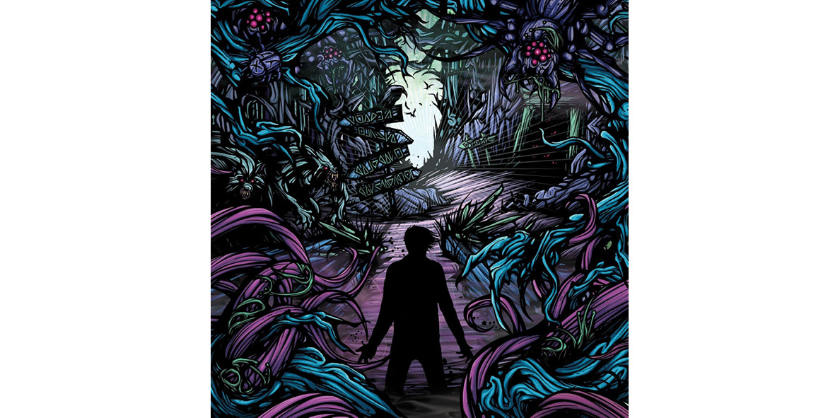
When you compare all of A Day To Remember's album covers, you notice they all feature this identity-less figure. I'm not sure what the statement is that they're trying to make with this concept, but I'm a fan of the continuity it brings to their albums.

Love. Angel. Music. Baby. – Gwen Stefani

The first album I ever purchased when I was 14, there's something about the distortion and mess of colour that sucks me in and makes my mind want to discover what is happening in this artwork. Well done Gwen, you've managed to find an album cover that looks as you sound (which is a great thing!).

Plagues – The Devil Wears Prada

If you've really been reading this post, you may have noticed that this cover, and the Homesick cover look very similar. And you would be right in that assumption. The artists name is Dan Mumford and his work seems to be a reoccurring favourite of mine (he's made a number of my favourite album covers that didn't quite make the list). Dan, you're a creative genius.

Singularity – Northlane

I don't know whether it's the beautiful fusion of colour featured in the sky, or the weird ritual happening in the foreground, but I just love the album cover for Northlane's latest album.
On second thoughts, I think it's the sky that I like about this cover.

Sound of Melodies – Leeland

If I were to hone my illustration skills, this would be very similar to my own personal style. I guess that's why I like it. That, and my OCD smiles at the symmetry.

The Flood Deluxe 2 – Of Mice & Men

An ampersand that looks textured and 3D. Need I say more?

United Paper People – Kisschasy

A personal favourite of mine was listening to Debaser's presentation at AgIdeas 2013. They are responsible for this album cover (which is apparently based on oil paintings). This cover was a favourite of mine when it was released in 2005, and still continues to be. I guess that speaks volumes about the creative geniuses behind this artwork.

What Seperates Me From You - A Day To Remember

I couldn't decide between this and the Homesick cover, so I decided to feature both in my list (that's the reason why there's 11, but I'm sure you didn't notice that, right?). The figure is featured again, as is a few of the bands acquaintances, as people walking behind the hourglass.
I'm a fan of this illustration style.

Zion – Hillsong United

Yes, I wrote about this last time. Yes, this is the eleventh album cover when I said there would only be ten. Yes, it is another album cover from Hillsong.
I can't help myself! The designers at Hillsong may as well be a unicorn. They're mystical, magical, and poop out rainbows like this album cover.


So there you have it. My favourite album covers, and the blogpost I thought would never happen. 


"Album design will exist as long as music is being produced." – Debaser


Blog post by Danelle Morton

Saturday, 4 May 2013

AgIdeas Conference 2013

Hi all!
Last week that design went to the beautiful city of MELBOURNE for a creative conference called AgIdeas, and listened to some inspiring designers from different creative industries. Although it was only for a few days, there was so much to learn and soak up. I myself am still processing it all, and the knowledge that so many shared with us will be something I won’t forget.
So what did I learn? I wouldn’t even know yet how to put it all into words yet, However I have found 8 key points which were talked about which have left me with more to think about.

No. 1
DESIGN IS CULTURE
In our world we are surrounded by design, where it is good or bad. In a message from German designer Herbert Birnbach he stated:

“It is designers who teach us our culture”.
This shows the importance in the work we do in communicating to the public. Culture is something that we learn from what we see, and it is important that as designers we remember this when we create for the general public. Soren Luckins also said:
“We guide the public… do something that is good and contributes”.
He also explains that it is our job to guide the public.

No. 2
DESIGN SHOULD BE FUN
Although communicating culture is something which creates a level of seriousness in what we do as designers, we also need to make sure that our design process and the message we communicate is fun. This seemed to be something touched on by a few speakers. Herbert Birnbach emphasized that:

“design should be fun, for the client, and for the people who make it”.

If we do not make designs which are fun, how can we expect to engage with our audiences?


No. 3
LEARN ON THE FLY

Soren Luckins began skeaking about this topic with a statement: “I’ll end my time on this earth still learning”. This process of learning needs to be embraced in order to gain from it. We will never know everything, but this is a good thing. When we are always learning we create new things and develop concepts.
“To create new you need to be soaking up new”.
Andy Stalman also stressed the importance of this learning process in his message. “You cannot discover a new world with an old map”. He also talked about our comfort zones and the need for us to step outside these in order to learn. You are never in your comfort zone, as designers we need to think of new things and push further. He then goes on to explain that in learning, it is also important that we learn together as a team. “We is the new Me”.


No.4
TELL STORIES
When we tell stories, and believe in what we are saying, we are one step closer to making other people believe. Our job as designers is to make our client believe in the design and that it is what they need. Soren Luckins spoke further on this and explained that work needs to have a narrative and a story to give it strength. This Strength is what sells things.


No. 5
NOT ALL CLIENTS WANT GREAT WORK
This is an ugly truth about the industry as stated by David Nobay. Great is something which is open for interpretation and what we think is great is not always what someone else thinks is great.


No. 6
DESIGN WITH EMOTION
George Poonkhin Khut’s work in biofeedback encourages us to take something which is found inside and externalise it. In doing this we need to find an experience which is felt inside a person and express it in a way which can be communicated with others and understood.


No. 7
BE EXCENTRIC ABOUT THE DESIGN YOU ARE PASSIONATE ABOUT
This is something I learned from listening to the beautiful Gemma O’Brien who is a typographist and illustrator. Gemma’s love of typography is something which has inspired me to be excentric about the design which I’m passionate about. Her love of typography has lead her to think outside the square and create designs which people want. It even lead her to write over her entire body and walk down the streets of Sydney in a campaign to promote writing on designated graffiti spaces rather than someone elses property.
Youtube Video: http://www.youtube.com/watch?v=Nz3lXu3VxVg
Be passionate in what you do!

No. 8
GET GOOD AT BEING REJECTED
The Voice design studio, Scott and Anthony:
“Sometimes a great idea doesn’t work out intellectually and clients reject our ideas, leaving us on our arses”.
Rejection of designs is something we all have to deal with in our careers, this doesn’t mean we are bad designers, it just means that the client doesn’t want their ideas represented in this way. When our ideas are rejected, it is important not to give up and to pick ourselves up.

So what do I take away from this experience?
That is something which I am still figuring out. But I hope that the inspiration I’ve gained and the things I’ve learned will help me in pushing my ideas further and becoming a stronger designer.
Blog written by Amy Sonter

Tuesday, 9 April 2013

Incorporating trends into design

Trends in design come and go over time, leaving us in a world that is constantly changing around us. It’s exhausting to keep up with this constant shift sometimes and it is important not to be left behind when trying to reach an audience. So should we be incorporating these trends in our design? The answer is a tough one and open for interpretation.
An important thing to remember about trends is that they represent an era or time period; who could forget the highly fashionable shoulder pads and leg warmers of the 80’s, or trends like creating 3D letters on absolutely everything. When we design something using current trends it will one-day be looked at as being a part of that era in design history. With this in mind, it is important to take into account the length of use for an item when creating a design solution. Things with shorter life cycles like posters, fashion items, cards, and diaries, will theoretically be on display for a set amount of time where it is much safer to use current trends. However other areas like corporate branding, logo design, and anything that can’t easily be redesigned, needs a solution which not only appeals to the current market but will continue to do so once trends have changed. This suggests that sometimes a more timeless design solution is more appropriate.

So how do we find the balance in using current trends?

Do your research

Remember that initial idea that pops into your head when you hear about a project? These initial thoughts may have influences from current trends, and existing ideas which we’ve already seen floating around. Sometimes it’s hard to break past this initial thought and develop it into something which stands out and apart from what’s already out there. This is why it’s important to do some careful research and find ways to incorporate inspiration whilst still creating an original design. What could be an acceptable design solution can become extraordinary with a well-researched conceptual approach.

Don’t over use trends

Don’t be that designer who didn’t know when to move forward. When everything looks the same it is hard to effectively reach people and create something which stands out. Trends might be popular but this is not a strong enough reason on it’s own to justify using them.

Find the best design solution

The best solution for something may not necessarily involve a particular trend in the industry. To effectively incorporate a current trend into a design it needs to fit with the brief and be useful in reaching the viewer and/or potential customer. In other words the design needs to call for a trend.

So while using trends helps us to reaching an audience it is important to only use these trends when it is suitable. It is also important to ensure that in using current design trends, we don’t loose our ability to push ideas and concepts to their full potential. So maybe we need to take a step back and look at current trends with a wider perspective and remember that one-day we will be looking back on these design trends as a past phase.

Blog written by Amy Sonter

Friday, 5 April 2013

Design Missionary


I have always been completely in awe of professions that enable lives to be saved. 
Doctors, Firefighters, Police Officers, Therapists, Scientists, Musicians, Veterinarians, Teachers, Humanitarians, Life Guards, Social Workers, Pastors, Missionaries. The list is endless.But what do I have to offer in the plight to save lives? I want what I do to actually matter, to make a difference. I want the opportunity to save lives.

I first became aware of Jay at Hillsong Conference last year. He spoke in a Creative Design lecture I was attending, where the things that he said radically changed the way I looked at all things creative and showed me a link between what I study, and my personal beliefs.

“Sometimes God has a hand in changing, influencing and giving you ideas in a prophetic sense so that your design can impact upon the people. All your creativity comes from God. He is the original creative.”

I can be a missionary, just like I’ve always wanted. What I do has the ability to speak to people outside of my Church, which means I can take God to places others cannot reach. I can bring people to know my God through my designs.

Jay uses his gifts in design a way I never dreamt possible. Being the Art Director of Hillsong Church is a platform that enables him to reach millions of people (considering that Hillsong United album ‘Zion’ reached #1 on the ARIA charts). He is someone I regard to be my biggest influence in continuing with graphic design, not just because of his creative work but by the purpose that drives him.

Now I can face my design future knowing that whatever I do and wherever I am, I can make a difference through what I do.“Sometimes God has a hand in changing, influencing and giving you ideas in a prophetic sense so that your design can impact upon the people. All your creativity comes from God. He is the original creative.”


You can find more of Jay’s work here.

Blog written by Danelle Morton.


Monday, 25 March 2013

Setting Boundaries: Just Say 'No', Part 1

Mad Month of March?

(Wow. I seriously can't believe how busy this semester has been, and it's only just started! It's been busy, but it's been amazing. I have loved every minute of of this semester so far.)

Thus, more than ever before, I think it is important to be setting boundaries.

A discussion on this topic arose last week, when Danelle and I accidentally said 'yes', on behalf of That Design, to producing some additional design work for one of our clients. A tiny, little, extra piece of design work wouldn't hurt anyone...we thought. 

But little things add up.

Little things add up into big things.

When you say 'yes' to 10 different little things, they become a very big thing indeed.

Anyway, I'm not here to talk about addition, and how 1+1+1+1+1+1+1+1+1+1=10... As suggested by the title of this blog, this blog is about setting boundaries. There is so much that could be said about setting boundaries. 

But personally, I feel the most important aspect is learning to say 'no'. 

Such a short simple word, one of the easiest to pronounce and spell, yet one of the most difficult to actually say. And one of the most essential.

Learning to say no is an important life lesson that I've only just started putting into practice. 

It's difficult.

There are many reasons why people find it difficult to say no. You just want to be agreeable. You genuinely want to help the person out. You feel a sense of obligation. But the main one for me, I think was a fear of missing out on opportunities. In other words, I was suffering from a strain of FOMO.

FOMO: Fear Of Missing Out.

It's funny, because all this time, (up until I started writing this blog post) I thought I was immune to FOMO. I thought FOMO was all about the social life, of feeling the need to go to every social event, or hanging out with a group of friends all the time, because you don't want to be left out when they talk about the great time they had last night.

I had a fear of missing out on opportunities: the ones related to my goals of becoming a successful graphic designer. In short, I said yes to far too many underpaid, or unpaid jobs, I figured they were a good way to practice my skills, and figured they might lead to greater opportunities. And to a certain extent, yes they probably have.

But. I. Was. Exhausted. (and also felt a bit used and ripped off)

I was absolutely burnt out by the end of last semester. 

The whole holidays I couldn't bring myself to do anything at all related to design, or art, or photography. I didn't even want to come back to college to finish my degree, as it meant I would have to be doing all of the above. 

I wanted to study carpentry. (I actually still kind of do)

But here I am. Back into design work. But the difference is... that I now know how to say no. 

And I'm loving it.

I now fear 'Fear Of Missing Out'. What I now fear is missing out on 'me time'. Missing out on taking time out to enjoy a hot cup of tea, or having extra hours of sleep. Missing out on having time out to spend on personal hobbies and projects. Missing out on people and friends.

Just yesterday, I said 'no' to something and explained it was because I really felt the need for a nap. That felt good. I think the hardest thing sometimes about saying no, is being able to put your own needs first: getting enough sleep, exercise, and healthy food a number one priority.

The default position for me is still 'yes'. But I now know how to override the default settings.

What helped me a lot was reading this line on some blog one day during the holidays:
"Saying yes to something means saying no to something else."
But knowing how to say 'no' can be the biggest challenge. Saying 'no' outright can seem so blunt, and harsh. Here are three good ways to say 'no' in an honest yet gentle way:
  1. "I'd love to help you out... but ________" This tells the other person that you love their ideas, it compliments them and keeps the other person feeling good. But it lets them know that your plate is full with other needs/commitments. A good way to still help the person out without overcommitting yourself is to suggest another person suited to the job.
  2. "Let me think about it first and get back to you" One reason I prefer emails and Facebook messages to phone calls and face to face communication is that you naturally have more time to think things through. It's often way too easy to get caught up in the moment, and the contagiousness of the other person's excitement and say 'YES!' in the heat of the moment, and then regret it later. (I have done this too many times) One thing I need to learn is that it is ok to ask for time. 
  3. And I really like this one from Oprah's website (I will be implementing this policy): "I'll have to sleep on it: I have a policy of not making decisions straight away." 
That's all from me... for now. Look out for a Part 2 of this series on 'Setting Boundaries', as I practice the delicate art of saying 'no'. 

And then possibly a blog post on 'Pushing Boundaries', which will be fun ;)

Wednesday, 20 March 2013

Did someone say designers?

Hello blogg-o-sphere!! Traffic manager Eily here. 
What a great first couple of weeks we have had already in the studio. Already we have taken a number of briefs and completed some client works. Keep and eye out for posts were we show you how we do what we do. We are so looking forward to taking you on our journey for 2013 within the studio. Incase you didn't know, we have just started a facebook page (That Design Studio) and a Instagram (@thatdesignstudioavondale) follow us to find out more about the workings of the That Design Studio.


Eily, x

Monday, 11 March 2013

Welcome Team 2013

Hi all, Wow, week three of our College term—where did the time go? Our new team has been settling in, understanding their roles and becoming acquainted with new and existing clients. Eily, Danelle, Jacinda and Amy are four talented, passionate and discerning young designers ready to take on the that design studio. The girls will be posting in this space, sharing their year long adventure with you. Welcome to the that design family girls, I look forward to working with you!